When Hilton (with My Help) Broke Its Own Photography Rule
Some of the world's biggest brands protect details most people never notice. The Tiffany & Co. signature blue isn't just “their color,” it’s a legally trademarked Pantone shade (PMS 1837) that no one else is allowed to use commercially. FedEx runs a different color per division, green for Ground, red for Freight, but the logo structure and spacing never move an inch. UPS trademarked the exact shade of brown on its trucks (PMS 476). These aren’t simple preferences.
That's the pattern behind most brand guidelines, and the argument I made in a recent post about brands that know when to bend their own rules. Hilton is a good example of exactly that kind of exception. They’re rules, and for most brands, breaking them isn’t an option. So it’s notable when a brand does break one on purpose.
Hilton Hotels & Resorts has a well-defined visual style for their guest room photography.
Even, bright lighting. Minimal shadow, minimal contrast.
Show a soft, almost “dreamy” quality. Produce the kind of image that looks like it was shot at the same hour in every location, regardless of where the property actually sits. Could be California or New Caledonia—it’s gotta look and feel the same.
The Hilton “look” is one built for consistency across thousands of properties (~600 in Texas alone!). But I think it’s a look that can feel a little anonymous out of context.
When Hilton San Diego Bayfront went through a complete redesign early in 2026, they also reconfigured one of their more luxurious rooms: the King Bedroom Bayfront Suite. The remodel went further than new furniture and wall coverings. The team moved the design palette away from the eggshell-only tones used elsewhere in the property, incorporating ocean and sand colors, more texture, more warmth, more details.
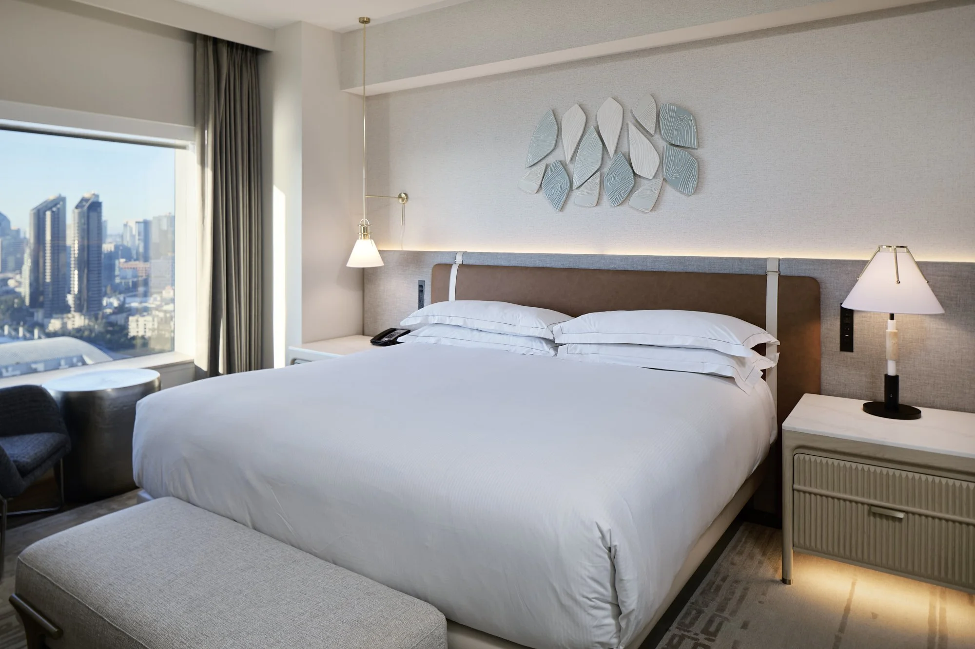
Hilton San Diego Bayfront Bedroom
Eric Stinson, Complex Director of Marketing for Hilton Hotels of San Diego, and his team wanted my photography to match that shift. So we planned to shoot it late in the day, to let the low sun reflect off San Diego Bay and cast real shadows and highlights across the room. This made the space feel like an actual moment in an actual place instead of a controlled, shadowless “studio”-feeling shot.
That’s a major departure from the company’s brand standard, and it raised some questions from corporate at first. But once my images went live, and the room stayed consistently booked, the vision Eric's team had pushed for held up.
“The imagery is consistently cited as a differentiator in the [trade] coverage we got,” Eric told me, “and internally it has become the reference point for how we want future renovated spaces shot. That’s a meaningful shift for a brand with as much established visual precedent as Hilton.”
The actual editing, for what it’s worth, was pretty minimal. I pulled a little glare off a glass tabletop, and removed a sun hotspot on a throw pillow. The room itself (and gorgeous San Diego afternoon light combined with my Profoto strobes) did the rest of the work.
See more from that shoot, and the rest of the Hilton San Diego Bayfront renovation, in my full case study.