Why I like “Lights Off” on an Interiors Shoot (Part 1 of 2)
Boom Boom—Out Go the Lights
If you've spent time with Dwell, Architectural Digest, or Luxe magazines over the past 20 years or so, you’ve absorbed a visual style convention without necessarily knowing it: Almost nothing in those interiors is actually lit up (using the lights existing in the space). Pendant lights hang unpowered over dining tables. Bedside lamps sit dark. Ceiling can lights just can’t (oof—sorry). Flip through a stack of recent issues and you’ll be hard-pressed to find an electric fixture switched on.
That’s not an accident, and it's not a trend that happened by itself. It’s a very specific, deliberate choice, and it’s also my preference (although, just like at home, I don’t always get my way).
The Problem With Leaving the Lights On
Every light source in a room has its own color temperature—and it’s more apparent to a camera than to the human eye. Daylight coming through a window reads cool and blue. A warm-white LED reads amber. An older incandescent bulb skews even warmer. A fluorescent tube can throw a faint green cast. Mix two or three of those in one frame and you’re not photographing a room anymore, you’re photographing a visual kerfuffle.
A camera sensor has to pick one white balance for the whole image. Get it right for the daylight and your lamps go orange. Get it right for the lamps and your window goes blue. No amount of time in editing fully untangles that once it’s baked into the exposure, because you’re not correcting one cast, you’re correcting several different casts in different parts of the same frame simultaneously. There are, of course, ways to stack exposures with different white balance values in Photoshop, and layering is a very standard part of my workflow. But it is also incredibly time consuming, and most photographers will agree that getting it right “in camera” is the overarching best practice in the majority of cases.
So what do I do? I turn everything off, light the room myself with strobes matched to a single, controlled color temperature (daylight typically), and the problem disappears before it starts. The wall paint reads as the actual paint color. The ceiling reads white when it’s supposed to be white, not a warm off-white because a can light was fighting the window. If a designer has spec’d a very particular material or a client has a brand color that has to hold, that consistency isn’t optional. You also don’t get weird blooms all over each lamp, sconce, and other light fixture. God bless dimming controls, which can help this problem, but they don’t exist everywhere. You’d be surprised how bright even the lowest-dimmed light fixture can look in a photograph.
Turning It Off Isn’t the “Honest” Choice
I want to be careful here, because it would be easy to frame this as “lights off = accurate, lights on = fake.” That’s not actually true, and one of the most famous architectural photographs ever taken proves it.
In 1960, Julius Shulman photographed Pierre Koenig’s Stahl House. The iconic image shows with two women in white dresses in a room suspended over a glittering nighttime Los Angeles. The interior lights in that photograph weren’t left on to document the house. Shulman deliberately flashed them on as his models settled into pose, layered over a long exposure of the city below. He said himself that the picture wasn’t meant to be an architectural photograph at all. It was a picture of a mood.
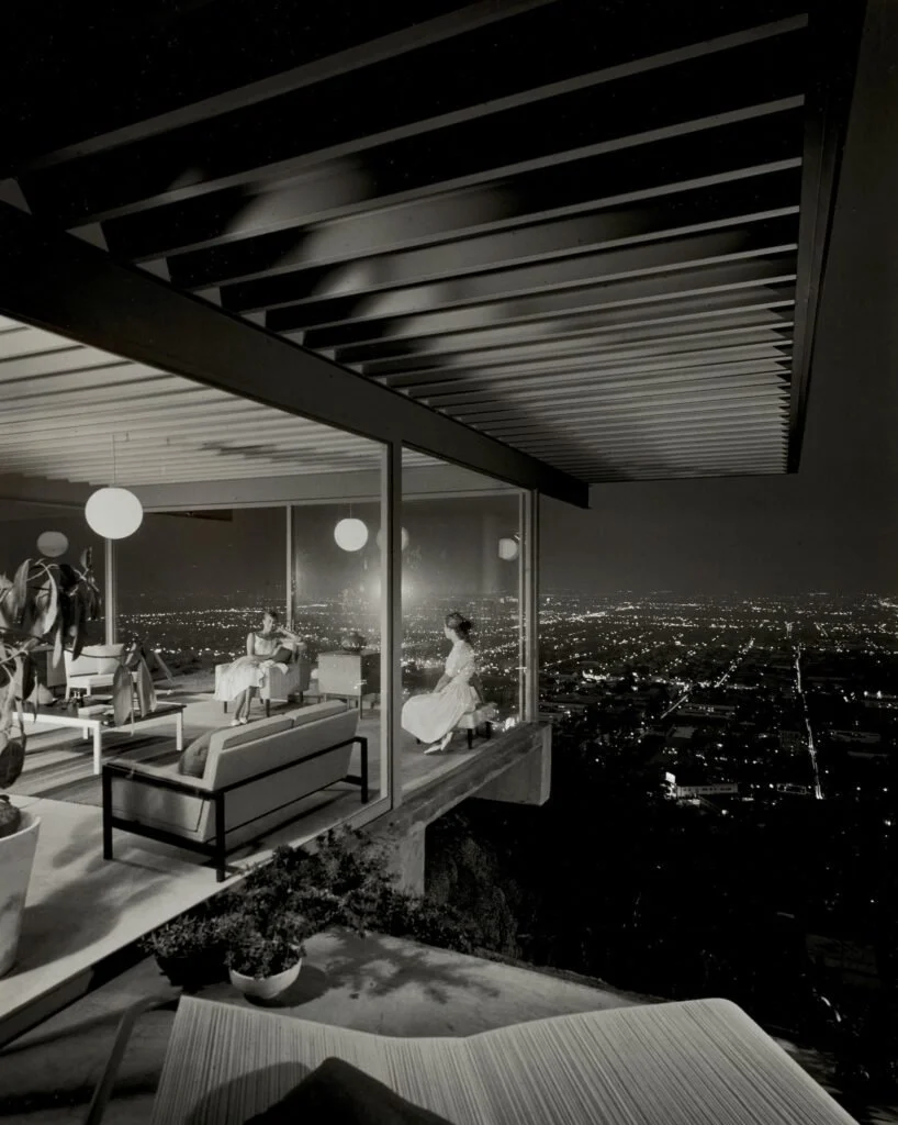
Julius Shulman, Case Study House #22, Pierre Koenig, Los Angeles, California, 1960, Silver gelatin photograph
So no, lights-off isn’t the truthful approach and lights-on isn’t the deceptive one. They’re both tools aimed at different goals. Shulman was building a feeling. I’m usually trying to present facts: what does this material actually look like, what color did the designer actually choose, what will a viewer actually see if they stood in this room in the middle of the day. Different job, different tool.
In Part 2, I’ll look at how rooms used to be lit in the days of film photography.