Why the Look Wasn’t Always This Way
If you've got old design magazines lying around from the 1980s, pull one out. You'll see the opposite convention: fixtures glowing, ceiling lights on, obvious, harsh shadows all over, a warmer and busier feel across the whole frame. That’s not because photographers back then had worse taste. Slide film, the standard for commercial photography of that era, has a much narrower dynamic range than a modern digital sensor shooting RAW and is far less forgiving—in the days before digital editing—of mixed light sources. Shooting on transparency film without ending up with the color-cast problem above meant using hot, continuous lights (out of frame) and often just accepting a warmer, busier-looking result. The look changed as much because the tools changed as because tastes did.
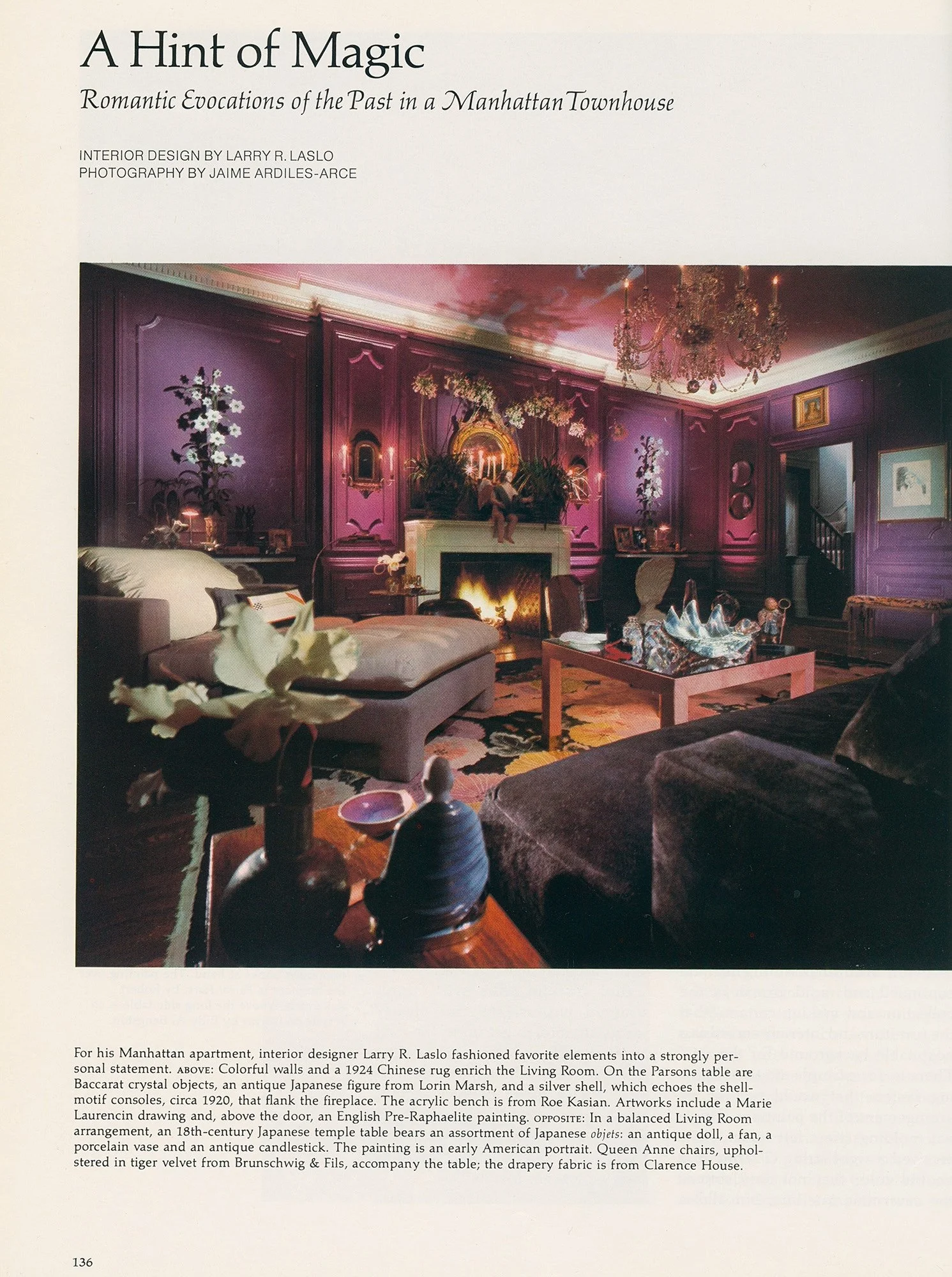
Architectural Digest January 1981 — the lighting fixtures (and hot lights out of frame) are working overtime!
Same Rule, Tested Against More Rooms
I shot the US Grant Hotel in San Diego, and the property makes the point better than I could explain it in the abstract, because I treated two parts of the same building completely differently, on purpose.
In the guest rooms, the lights are off in every shot. One room has a detailed, subtly patterned wallpaper behind the bed, the kind of surface that only reads correctly if the whites and warm grays in it are true. A brass-and-glass pendant hangs directly over the table in that room, and it stays dark. Lighting it would have pulled a warm cast directly into the busiest, most detailed part of the frame, right where the pattern needed to read cleanly.
The lobby is the opposite call. A multi-tier crystal chandelier drops through a marble-floored hall lined with columns, and every bulb in it is lit in the final image.
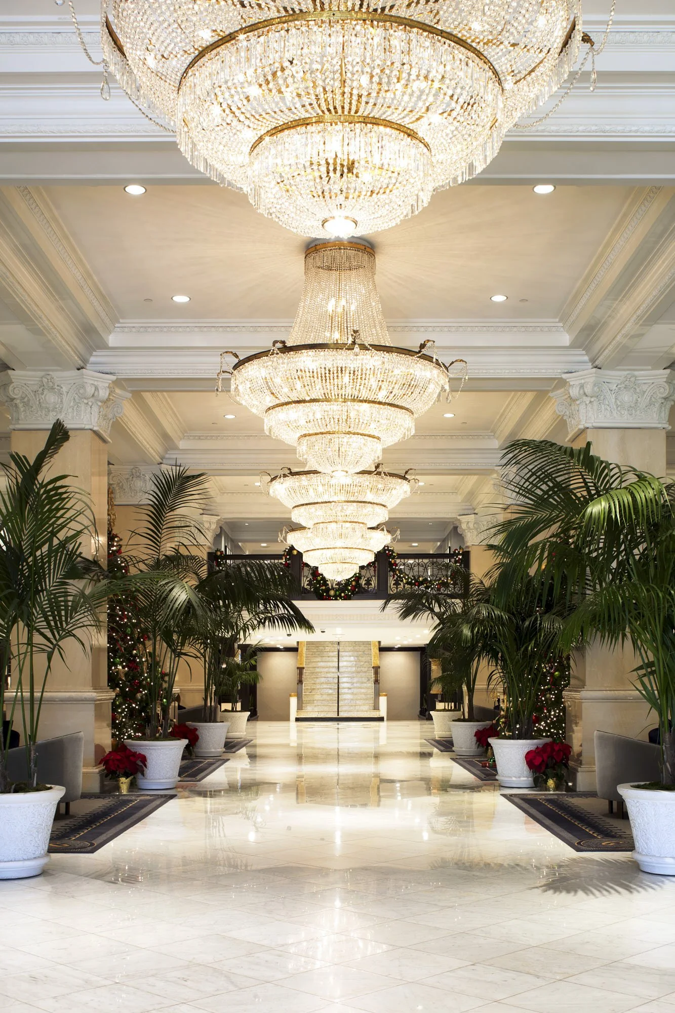
The lobby of the US Grant Hotel in San Diego, California (shot on Fuji GX680 and Hasselblad back) showing extant lighting
My first instinct was to explain that split as “the fixture stays lit when it’s the point of the room.” It’s a tidy little phrase, but knowing me, it’s wrong. I have plenty of shots where a genuinely showpiece fixture, a sculptural brass sunburst over a bed, matching swing-arm sconces, a pair of statement pendants over a kitchen island, stays completely dark, even though each of those is every bit as much a deliberate design choice as that chandelier.
The actual rule is narrower and less flattering to state cleanly: the fixture goes dark whenever there’s a material in the frame that has to read true. A saturated wallpaper pattern, a curated wall of framed art, a specific paint color on a run of cabinetry, any of those will shift or muddy if a warm bulb bleeds into the shot, so the fixture loses to the material every time. The hotel lobby has none of that. Marble, gilt trim, palm fronds, nothing in that frame is a delicate, specified color a client is depending on me to protect. With nothing fragile to lose, the chandelier gets to do its job and blaze.
So it was never really about how important or beautiful the fixture is. It’s about whether anything else in the room needs to be trusted.
What This Means If You’re Planning a Shoot
I know a lot of interior designers push back on this instinct on set, and understandably so. Nobody wants to walk away from a shoot without proof that the fixture their client paid for actually works, or that the lighting designer’s scheme reads the way it’s supposed to. I don’t think that instinct is wrong, it’s just solving for a different photo than the one that’ll actually end up in your portfolio, your award submission, or your next magazine pitch.
I often joke with my design clients that if they want the lights on, why not also turn the faucets on, or highlight a flushing toilet, to prove they also function? (I didn’t say it was a great joke.)
My approach is to build the shot around the room, not the switches. Rebuild the light from scratch with a controlled color temperature, protect the actual colors, the actual materials, the actual brand palette if there is one, and get you the kind of image that reads the way the rooms in the publications you’re already drawn to read.
If you’re planning a shoot and want to talk through how a specific space, or a specific fixture, should be handled, that’s exactly the conversation worth having before we ever get on site.